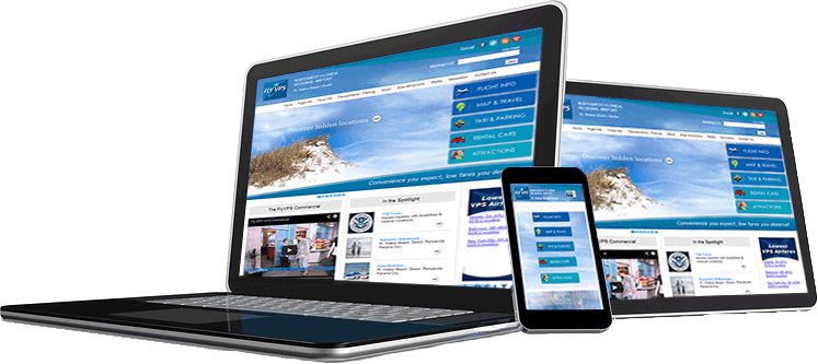
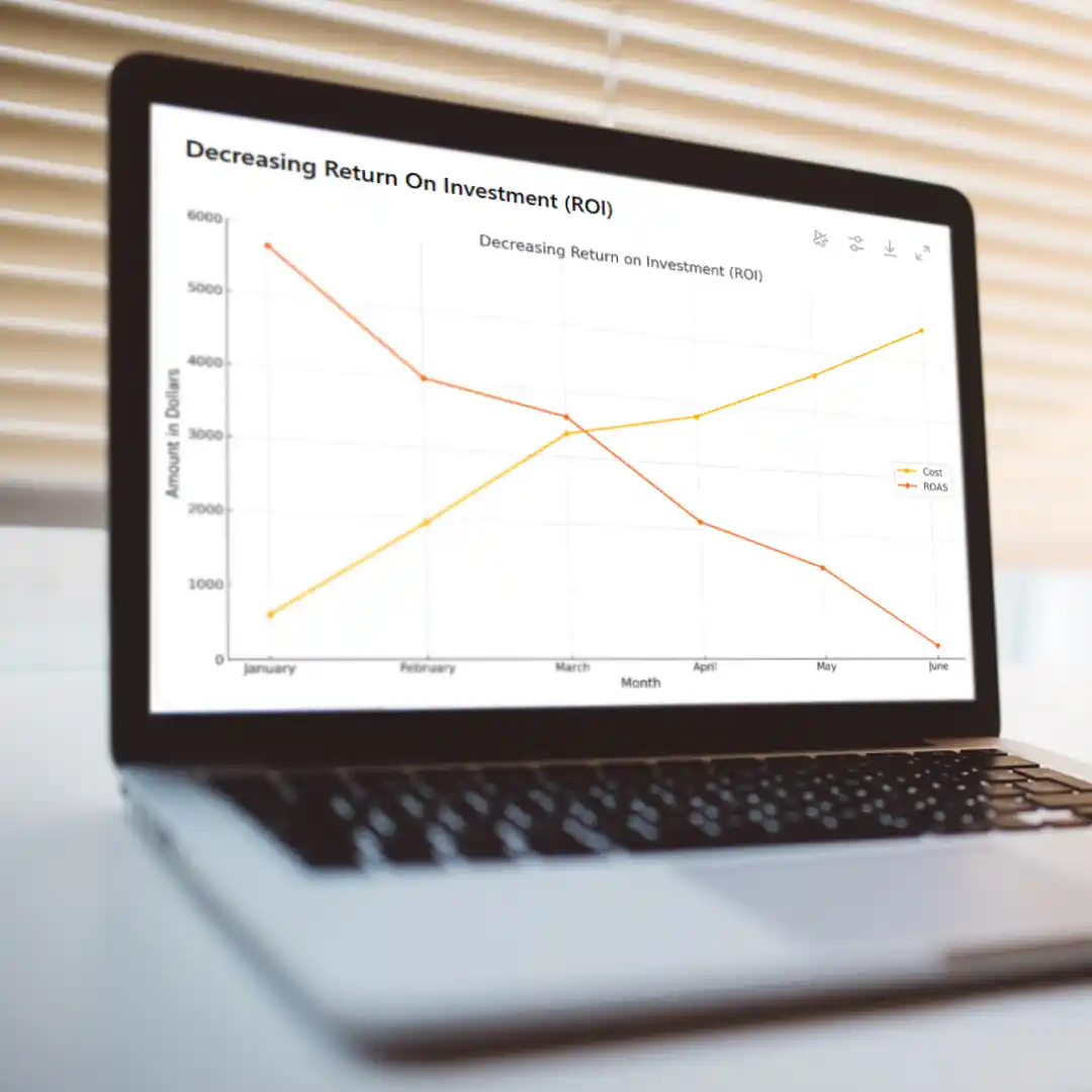
 When anyone approaches us to discuss hiring us for SEO or PPC work, the first thing we do is look at their website. That’s because the website is the single, most important element of an Internet marketing campaign. To perform the SEO or PPC work without first making sure the marketing efforts will drive traffic to an effective website is similar to someone trying to sell a faulty or unwanted product.
So what is an effective website? This varies based on the industry, target audience, and of course, personal preference. You will never please everyone because of differences in personal taste, and individual style. However, there are some best practice guidelines that can and should be followed.
Branding
Make sure your company logo is on every page of the site. The top left side of the page is where people generally look for it. Include a tag line if your organization has one. This should be a quick phrase that people associate with your company or organization and gives people an idea about what you do and what makes you unique.
Consistency
Every page should be consistent in design so the visitor is not trying to figure out how to get the information they’re seeking from the site. Using a standardized template is a good way to accomplish this.
The Home Page
Obviously, this is the most important page of your site. This is where you get to make your first impression and where a potential client will decide whether they want to stay on your site to look for products or services, or not. While the home page should confirm to the visitor that they’ve found what they are looking for, it should not be so full of information that it discourages further browsing. Think of the home page as an introduction and a launching pad into the rest of the site. A good home page should include:
- Product or service description
- The product or service you provide should be very obvious and presented in an uncomplicated manner. If the potential customer has to look to figure out what you offer, they will not stay on your site. Additionally, if the product or service is industry specific, for example, then having an option for each general category might be a good idea.
- Say more with less. Fewer words and an image (see below) can have more of an impact because it will more completely convey your message than using a lot of words which go unread.
- Testimonials
- Though you also want a testimonials page, having a testimonial or having a scrolling list of testimonials on the home page is important because this will tell potential customers what others are saying about you.
- Images and videos
- The old saying, “a picture is worth a 1000 words” is so true. A visual of your product, service performed or staff they will meet is irreplaceable.
All this may seem very simplistic, but it is amazing how many websites we see that are so vague or complicated that no one can figure out what they are “selling.” It’s also not uncommon to encounter websites in which visual cues are unclear, so you don’t know what’s clickable or the message is unclear to the visitor so they don’t know why they should stay.
Often, a website owner will have an overly optimistic opinion regarding the effectiveness of their website. If you are uncertain about this, then take a look at your website statistics to see the bounce rate on your site. Google defines a bounce rate as “the percentage of single-page visits or visits in which the person left your site from the entrance (landing) page.” Therefore, if you have a high bounce rate you may want to consider either making some changes to your site, especially the home page, or redesigning it completely. We realize this is a lot of work, but it will be well worth it. While the website is being edited, you can also have the optimization done at the same time. That’s where Market Vantage would love to help you.


