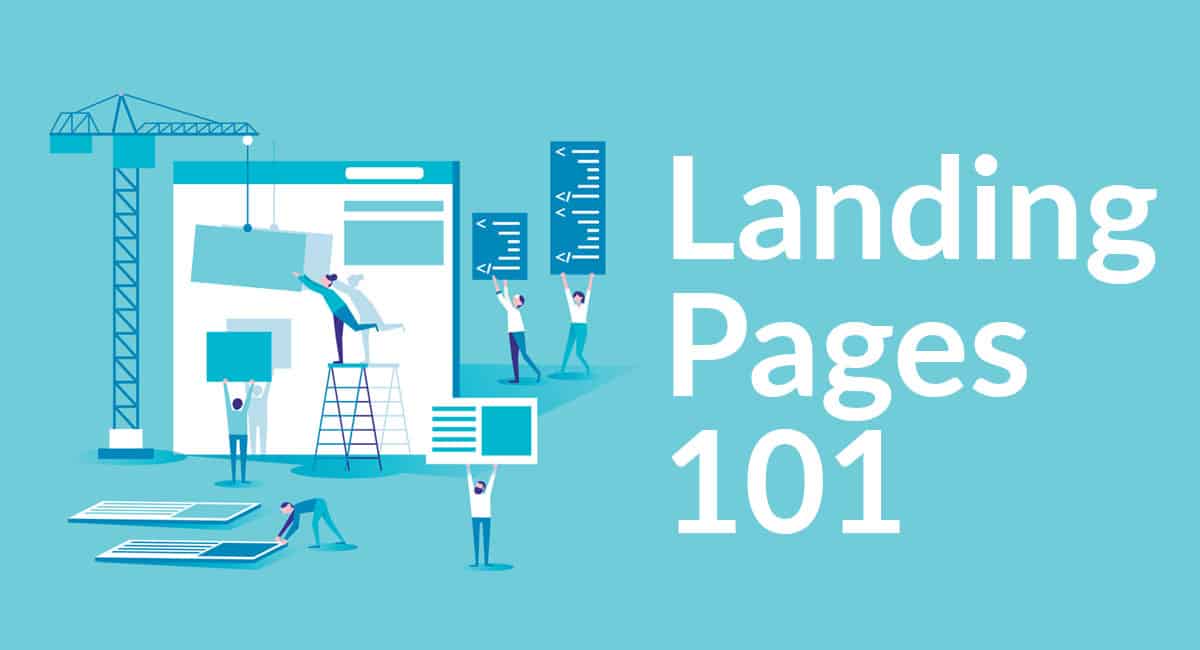
Landing pages provide a unique opportunity to achieve a goal on your website in an enticing and informative manner. We’ve found that not all businesses have optimal landing pages, so we created this article as a guide.
Do note that this article only provides a brief overview with general recommendations – results and specific attributes of landing pages vary by industry and audience.
Before we jump into landing pages, we need to provide some terminology: A “landing page” is a web page where someone arrives after clicking an ad, link or button on another website. Every landing page should be designed to entice a visitor to complete a specific goal. That goal could be to make a sale, capture a lead, or achieve visitor engagement and build brand awareness. If the goal is completed, the visitor has “converted.”
With that out of the way, let’s jump right in to the tips:
It Starts with the Right Audience
One of the great advantages of Internet marketing is the ability to target your audience. Regardless of what you are selling, putting a great offer in front of the wrong audience isn’t going to turn out well. The most common mistake we have encountered when evaluating a potential client’s AdWords or Bing Ads account is poor targeting. Bad targeting will result in one of two outcomes: Either you will get very few clicks or worse you’ll pay for lots of clicks that won’t convert.
Make a Good First Impression
Now that you have a targeted prospect on your site, you only have a few seconds to entice them to stick around. Maybe you hinted at an offer in your ad copy. Don’t make them hunt for it when they arrive. Be sure to reinforce their confidence that they have landed somewhere useful and interesting.
Show them how your offer or service can make a positive difference in their life or their business, but don’t overwhelm them with features, speeds and feeds. Earn their trust first by showing the logos of your existing customers or some testimonials. Other people’s opinions matter, which is why Amazon gives Reviews such a prominent place on product pages.
Follow Industry Standards
Great marketers and business people understand that the user interface of websites can’t be too radical, or they’ll turn off the buyer immediately. As technology has changed, people have come to expect certain things in certain places, like logo and content positioning. There are plenty of studies that explain how people’s eyes track through web page content. Do some research to see what the market and your competition is doing to see what is working well (or not).
Keep It Simple
People love being given choices – Some marketers swear by long-form landing pages that tell a story and take 20 minutes to read. Others start some sort of timer with an offer that expires, to create urgency. What works best? It depends on the situation, what you’re selling, the competitiveness of your market, and the sophistication of your target audience. Our recommendation is to always err on the side of simplicity to focus on your core messaging and offer. Though your audience will tell you what they prefer through testing iterations of landing pages, which leads us to our next tip.
Always Test
There are no perfect landing pages, as the ways people behave and think are constantly changing. With that, go ahead and take your best shot at a landing page. You can then tweak it slightly to make an almost-identical twin, and alternate where you drop your visitors and measure the results. This well-established technique is called A/B testing. Once you have a clear winner, keep the page and try to beat it with a different version. The goal is to always be testing for improvements.
With these tips in mind, your landing pages can become a converting machine for your business – generating revenue from your website that you never thought was possible! Want more tips to help improve your landing page performance? Make sure to click the button below to schedule a free consultation!


